Part One | Part Two | Part Three
The arrival of the COVID-19 pandemic in the United States brought strong and widespread motivation to find innovative ways to leverage data and technology to fight the disease. By late April, over 21 unique “social distancing” and “mobility” metrics emerged out of at least seven different companies’ “Data for Good” initiatives[i],[ii],[iii],[iv],[v],[vi],[vii]. Whitespace Solutions began an IR&D project in that same spirit, aiming to produce epidemiological intelligence for leaders and researchers from anonymized, aggregated human mobility data[viii].
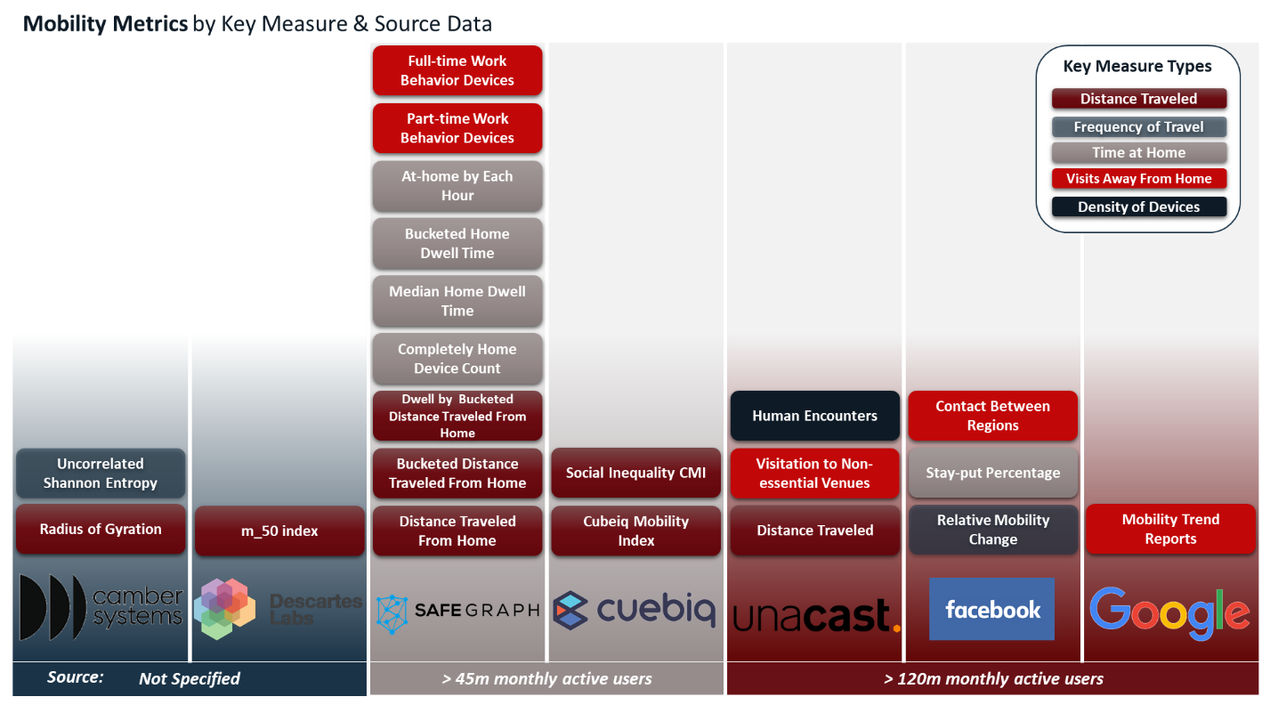
Figure 1: Mobility and Social Distancing Metrics. Each of the 21 publicly available mobility metrics are unique in terms of their published methodology but can be grouped by key measure type. Key measures focus on proxies for compliance with social distancing or other mobility restrictions such as: (a) distance traveled, (b) frequency of travel, (c) time at home, (d) visits to places away from home (e.g. work, retail, or other regions), and (e) density of devices by area.
Initial analyses using mobility metrics indicate that social distancing mandates work when they are followed[ix]. But just as we began seeing indications that stay-at-home orders were followed and that they slowed the spread of COVID-19, states began moving toward reopening and lifting stay-at-home guidelines.
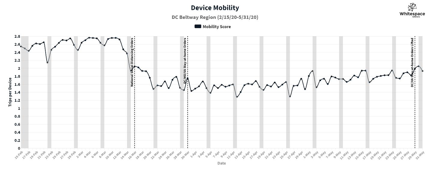
Figure 2: Changes in device mobility: DC Beltway Region, February 15th – May 31st, 2020
Prior to COVID-19 there was little evidence that social distancing policies would effectively slow disease transmission. Federal, state, and local governments in the U.S. looked to the policies enacted in countries such as South Korea and Singapore, where they asked their people to move around less, stay at home more, and either close entirely or radically alter the way they do business. The intent of these policies was not to reduce mobility, rather it was to reduce their contact rate[x], a key driver of disease transmission. These restrictions were proving effective overseas, and similar methods were adopted by U.S. leadership beginning in March 2020.
Now, several weeks after these policies were lifted, cases are increasing dramatically, currently setting new records in multiple U.S. states daily. In response, states are reverting to more restrictive policies, closing bars, restaurants, and beaches. But will these policy changes slow disease transmission? How long will they need to remain in place to be effective? Where will the next wave of cases emerge? Answering these questions requires actionable insight that other mobility metrics can’t provide: intelligence about key drivers of transmission.
The infection rate is driven by: (1) the probability that a contact results in an infection – and (2) the rate at which people are coming into close contact with others. The first is a biological feature of the disease and individual behavior (e.g. wearing a mask) that is not observable in macroscopic movement patterns. The second, contact rate, can be affected by policy intervention, and measured by applying Whitespace’s potential contacts analytics to mobility data. As government and businesses try to remain open, measuring contact rate for the entire population can provide indicators of where infection rate may be rising or falling over time, and inform policy-makers about how best to manage it before a crisis emerges.
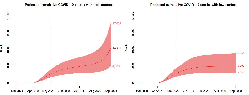
Figure 3: Impact of high and low contact reopening scenarios on projected cumulative COVID-19 deaths
Figure 3 above depicts how a reduction in contact between individuals can drastically reduce the number of COVID-19 deaths. In both cases, the transmission model provides a sense of what might happen in a medium-sized U.S. state with high transmission in April that began to reopen after June 1st. Reopening with weaker social distancing policies (high contact) produces double the deaths in September as reopening with stronger social distancing (low contact). The second graph depicts the type of outcome that policymakers would like to achieve: lower transmission, even as economic activity resumes and mobility increases.
Many U.S. states in the midst of reopening are now faced with increasing cases of COVID-19. Monitoring changes in patterns of potential close contact is critical to proactively managing policies to keep contact rate, and future deaths, as low as possible, even as people become more mobile.
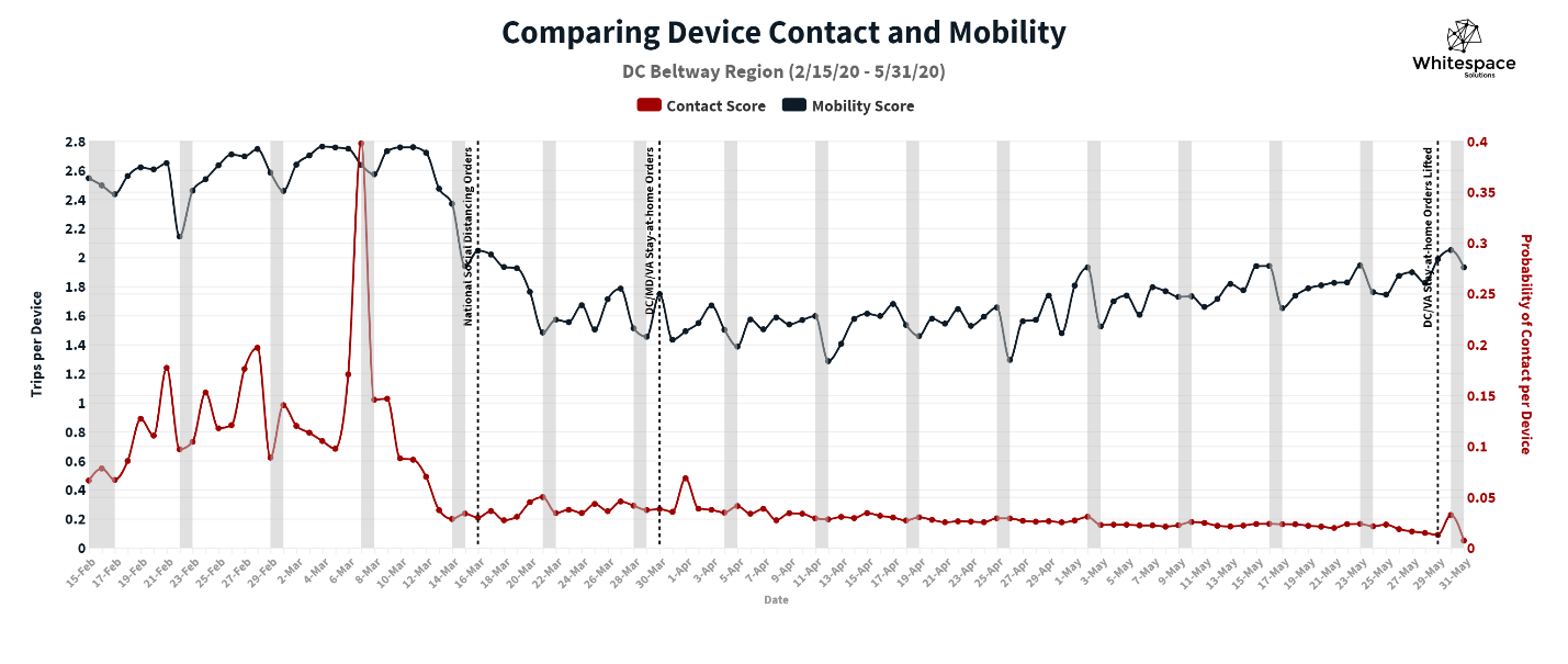
Figure 4: Comparing device contact & mobility: DC Beltway Region, February 15th – May 31st, 2020
This type of epidemiological intelligence about trends in potential contacts by region could help leaders tailor policies focused specifically to their jurisdictions to keep contact and infection rates low, while enabling citizens to carefully resume daily activities. Mobility could be variable, as depicted in Figure 4 above, but potential contacts could be monitored on a daily basis, giving an indication of how well social distancing practices were being followed even as people return to work and school. Our potential contacts analytics support monitoring changes in patterns of close contact on a hyper-local level, providing insight into the efficacy of targeted social distancing policies in particular health districts, even as steps are taken to lift restrictions on a county, city, or state-wide level.
In the third part, we will explore the process for producing potential contacts using mobility data and discuss how we use spatial data analytics to model potential contacts.
[i] “Facebook Data for Good Mobility Dashboard.”
[ii] Descarteslabs/DL-COVID-19.
[iii] “COVID-19 Community Mobility Report.”
[iv] “COVID-19 County Social Distancing Reporter.”
[v] “Cuebiq’s COVID-19 Mobility Insights.”
[vi] “SafeGraph COVID-19 Data Consortium.”
[vii] “Covid-19 Social Distancing Scoreboard — Unacast.”
[viii] “Contact Metrics.”
[ix] Gao et al., “Mobile Phone Location Data Reveal the Effect and Geographic Variation of Social Distancing on the Spread of the COVID-19 Epidemic.”
[x] The contact rate for an infectious disease, such as COVID-19, is measured in effective contacts per unit time in a population.

