This is mobile device data from the now infamous events of January 6th, 2021.
Our data visualization begins at 6:00 in the morning, the beginning of rush hour in the D.C. metro area. President Trump was not scheduled to speak until noon, but crowds gathered early at the White House Ellipse and the Washington Monument lawn. Additionally, by 11:30 am, a relatively smaller group had gathered on the east side of the Capitol Building.
President Trump began his speech promptly at noon. Less than 20 minutes into his address, a group left the Ellipse and headed down Constitution Avenue towards the Capitol Building. The walk from the Ellipse to Capitol grounds is just under 1.5 miles; a 20-30 minute walk, depending on one’s stride. The data indicate that at 12:50 pm, those who had walked in the group from the Ellipse to the Capitol reached the barricades on the west side of the building. Reports correlated with our data show that at approximately 12:54 pm, the crowd pushed through those western barricades.
Several news outlets and post-event research have approximated that the Capitol building itself was breached just after 2:00 pm. Our data suggest this breach occurred between 2:05 and 2:10 pm by the crowd on the east side of the building. By 2:30 pm the crowd that began on the east side of the Capitol building and the crowd that walked down from President Trump’s speech at the Ellipse had merged inside the Capitol building.
For anyone who is familiar with data and the myriad of ways it can be visualized, this is an important question. Let’s explore it.
First, we needed data that would show where people were during the events of January 6th. It’s no secret that today, most people’s devices, such as cell phones and smartwatches, have the ability to report location data. Location data is collected from several sources and can be used for a variety of purposes. Mobile phone carriers (Verizon, AT&T, T-Mobile, etc.) need to know where their customers’ phones are so they can provide services like phone calls and direct messaging. Phone operating systems (Android and Apple) need to know where their customers’ phones are so they can improve functionality and user experience. Sometimes, individual apps need location data so they can provide products to their users, such as apps that track how far you run, where your Uber can pick you up, what the weather will be like where you are vacationing, or where your food delivery can drop off your dinner.
Different location data collectors use different methods to get the information they need. GPS, or global positioning system, detects location using satellites and is probably the most commonly thought of collection method. Cell Towers are a close second. Mobile phone carriers can gather approximate location data based on which cell towers someone connects to when they make a phone call. Other ways that location data can be collected is via Wi-Fi networks or Bluetooth beacons. Again, approximate location can be assessed based on what Wi-Fi network a device connects to or how far a device is from a Bluetooth beacon.
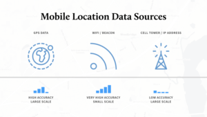
Due to the various collection methods, and the differences in each mobile device, location reporting is not always 100% accurate. Data cannot intentionally lie, but in some devices might report location with a higher accuracy than others (within a 1-meter radius vs 25-meter radius of where a device is located). However, this uncertainty can be mitigated using statistical algorithms. And, since most people have their phones on hand and readily available throughout the day, even with a little bit of uncertainty, mobile device location data is a good indicator of where people are at any given time.
But, is it ethical to track individual people going about their everyday lives? We at Whitespace, feel that it is not. If you’d like to read more about our thoughts on the ethics of big data you can check out our previous blog post. However, individual mobile device location data can be aggregated in a way that provides us analytical insight without compromising individual privacy.
By looking at all the devices together, we are able to approximate the shape of the crowd. And, by filtering the data to a specific geographical location and temporal period, we eliminate most privacy concerns.
Our visualization is unique because it is a more precise representation of crowd movements than what can be discerned from photographic and video accounts of the day. Unless you are an expert on the geographical region of Washington, D.C., looking at photos or videos may not be informative. There may be landmark buildings or signs in the background of images, but mostly, your eyes will be drawn towards the people themselves. This in itself could be an interesting study, do people’s faces show more outward signs of anger and aggression as the day progresses? But, it won’t tell us how the crowd moves.
Heat maps, another way to aggregate data, show density. They are an adequate way to visualize the volume of devices in an area. When we started examining data for January 6th, curated heat maps were a good start. However, it was difficult to discern the movement or speed of the crowd. And, there were no boundaries between crowd groupings. For example, there was no distinction between law enforcement on one side of the barricades and the protestors on the other. Instead, the heat map showed one shape that contained both groups. Our aggregated crowd dynamics give more distinction to these groups.
Additionally, Whitespace was already working with aggregated mobile device location data for our COVID-19 project, Data Pandemos. We were familiar with the data and already had a streamlined process in place to sift through all of the information. With our process, we pushed aside the noise, pulled out the data that really mattered, and produced a product that could lend insight to those who were interested.
First, we were curious. Could mobile device location data help us to better understand what happened that day? To understand what happened that day? To aid in law enforcement investigation? To predict if January 6th would become a super-spreader event for COVID-19? To pinpoint how and why a relatively peaceful crowd turned into a more violent protest?
Second, we had a sense of duty; to the people involved, the people affected, and to ourselves as data analysts and Americans. If we could discover something useful and important, weren’t we obligated to share it?
Further, a key part of Whitespace’s mission to enhance human security includes promoting human dignity. The actions that took place on January 6th did not stimulate either. As we’ve heard in the testimonies of the officers from the Inquiry Commission, law enforcement officers were attacked physically and verbally as they worked to defend the Capitol building and the country’s lawmakers. Doing our own research and investigation into the events of January 6th seemed to be the least we could do to help get to the truth.